The Coca-Cola Company’s lemon-lime soft drink Sprite has introduced a refreshed global brand identity developed in partnership with London-based creative agency forpeople, as part of efforts to strengthen its cultural relevance and modernise its visual presence.
The update focuses on refining Sprite’s existing brand elements rather than undertaking a complete redesign. The new identity aims to create a sharper and more distinctive look suited to contemporary consumer markets while maintaining the brand’s core visual heritage.
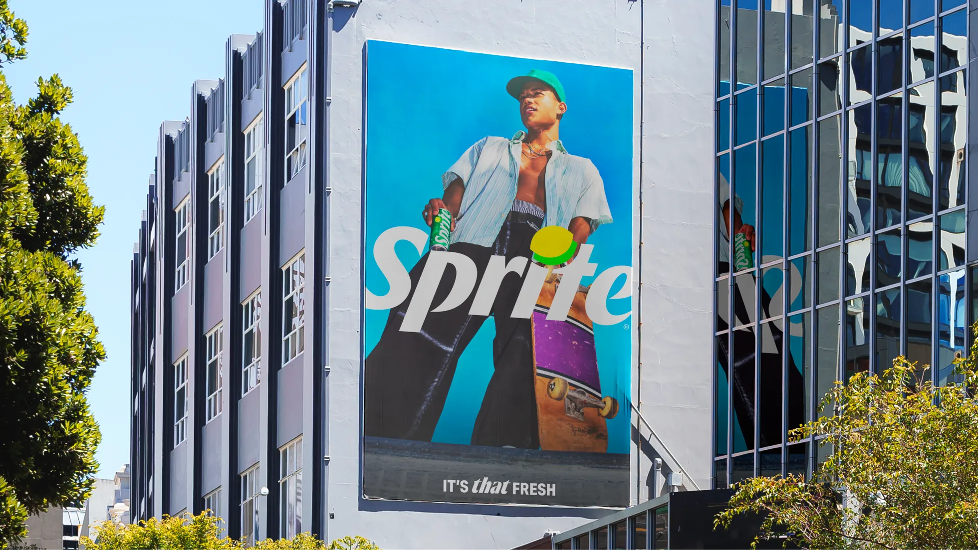
A key highlight of the refresh is the return of the Lymon symbol — a graphic combining a lemon and lime — which had long been associated with the brand. The Sprite wordmark has also been given greater prominence, with new packaging designs featuring bold vertical typography intended to improve shelf visibility.
The broader visual system introduces more dynamic typography with italic styles, angular layouts and high-energy compositions to reflect the brand’s long association with youth culture, particularly music, basketball and street culture.
Sprite is also shifting its photography approach toward more natural, lifestyle-driven imagery that highlights authentic moments and everyday experiences instead of highly stylised studio visuals. The colour palette has been strengthened with higher contrast green and white tones to emphasise the drink’s freshness and carbonation.
![]()
The refreshed identity will be rolled out across 180 markets during 2026 under the brand platform It’s That Fresh. The company also plans to announce new global collaborations spanning music, sports, food, fashion and street culture as part of the campaign.