How to know when parody is good for an ad?
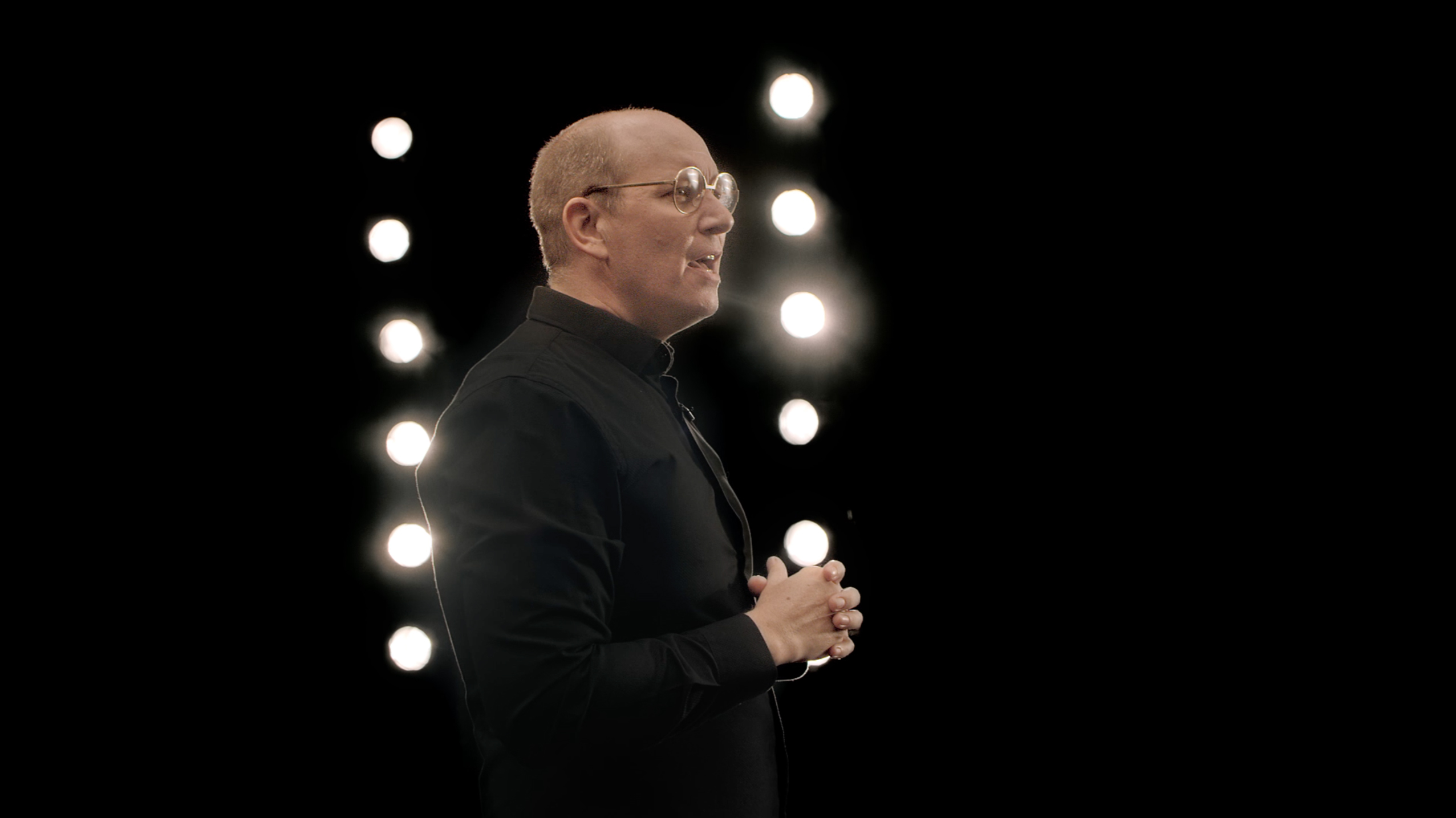
Nobody starts a brainstorming session by saying, “Let’s make a parody ad!” It usually fits right in. Often, the message of the ad and the audience you are speaking to will help decide if parody is a good fit. In our case, Nescafe wanted to talk about its new packaging. The coffee hadn’t changed a bit, it just came in a sleek new pouch. And that, to us, sounded similar to how tech companies launch their phones. Ta-da! Now we knew exactly what to parody.
What are the rules of a good parody ad?
The audience should immediately know that it’s a parody ad. That, to me, is the most important rule. They should know exactly what you are referring to; otherwise, it will come across as a weird ad. And to do that, copywriting and art direction play a crucial role.
You need to know exactly which elements you’re going to use to bring the parody to life. Is it the clothes? The language? The setup? Also, consider the way people really feel about those elements and dramatize them. It will always help if what you are creating a parody for is a recent event. Releasing the Nescafe new packaging ad soon after the new iPhone was launched helped us instantly connect with the audience.

How to identify the right thing to refer to?
Your insight, idea, and objective should lead you to the parody. There should be a common link between your message and what you’re referring to – and if there isn’t any, make one. The link can even be that the people who enjoy your product also enjoy the thing that you want to refer to.
What are the traps of parody advertising? What to avoid, what to pay attention to how not to overdo it?
Parody ads have existed before I joined advertising and will continue after I’ve retired. There are so many parody ads, both good and bad, and there’s so much to learn from them.
The most common trap is when the creative teams try too hard. In our case, we wanted to straddle between not being over-the-top but still be ridiculous enough for people to realize it’s a parody.
It’s also important to not spoon-feed the viewer. When you explain a joke, you are undermining the people watching it and the audience can see straight through it.
What you’re parodying also needs to be instantly recognizable. Because if a parody ad does not look like a parody ad it will only be a confusing ad. And nobody likes to make or watch a confusing ad. Ding dong.
Credits
Agency:
Abed Hassouna – Associate Account Director
Anas Shaherli – Arabic Copywriter
Jaison Ben – Associate Creative Director
Jessica van der Berg – English Copywriter
Marco De Albuquerque – Art Director
Maya Khammar – Client Service Director
Mayssa Al-Azem – Agency Producer
Raef Baskharon – Multimedia Designer
Ritu Poojari – Multimedia Designer
Sabine Abdallah – Senior Account Executive
Wassim Haddad – Digital & Social Media Director
Rana Najjar – ECD
Rafael Augusto – ECD
Client:
Arifa Hussain – Regional Marketing Manager
Raef Labaky – Business Executive Manager
Seif Eldeen Hamdy – Brand Manager
Director:
Bevan Cullinan
Production:
Dreamworks Dubai
Picture Tree South Africa
Post-production:
OPTIX Dubai
CGI Packshots:
ArsThanea
Sound:
BKP

