By
That’s the problem McDonald’s set out to correct last year with a comprehensive overhaul of the company’s global visual identity. The chain is massive: about 35,000 restaurants in 120 countries around the world, with 17,000 in the U.S. alone. Given that breadth, a chaotic visual identity chips away at the brand. Its mandate was to further CEO Steve Easterbrook’s mission to make McDonald’s a “modern, progressive burger company,” says Colin Mitchell, VP-director global brand at the burger behemoth.
To become more contemporary, Mitchell’s team, working with Chief Marketing Officer Silvia Lagnado, dug into the past. “We had this vision around feel-good marketing,” Mitchell says. “The idea behind it was very simple—that at its best, McDonald’s is more than just burgers and fries.”
The team took inspiration from McDonald’s seminal “You deserve a break today” campaign from 1971, from Needham, Harper & Steers in Chicago and decided it wanted to bring that joyful legacy to every consumer interaction, including the design. In late 2017, the company tapped Turner Duckworth to lead the makeover. Last fall, the first elements of the redesign debuted on various platforms and have continued to roll out in various forms since then.
Turner Duckworth broke the project down into three steps: decluttering; highlighting what’s already standout about the brand (introducing those feel-good moments); and identifying latent opportunities that weren’t already being mined.
“It was about clearing off the barnacles,” says Tyler Brooks, Turner Duckworth design director. “We wanted to go back to the basics.”
“McDonald’s brief of ‘making feel-good moments’ made it easy for everybody,” adds Sarah Moffat, Turner Duckworth global chief creative officer. “It’s a bit Marie Kondo: ‘Does this spark joy? Is this a feel-good thing?’ It if was, it stayed, if it didn’t, we got rid of it,” she says.
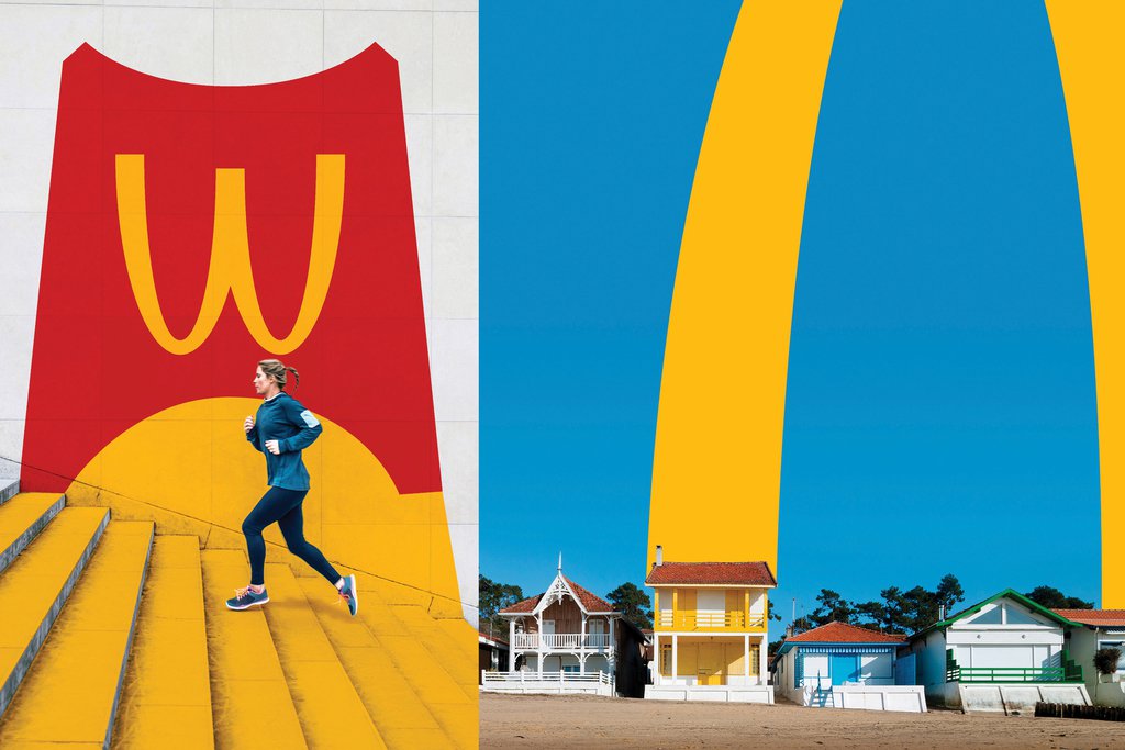
McDonald’s golden arches are the cornerstone of the new identity, used simply, dynamically and playfully throughout the brand’s communications.
Under the new design rules, the iconic arches are free to stand on their own. Previously, they had been locked with the wordmark. As with brands like Nike and Apple, McDonald’s can “officially” be an icon brand. “To liberate them from the static logo, that can go very wrong, but it’s also one of the great logos of the world, and we should release its potential,” Mitchell says.
Palette hierarchy
Historically, McDonald’s has been a red brand with a touch of yellow. With the overhaul, the arches’ golden yellow now takes center stage, accented by red, as in the interior shot above of the company’s Times Square flagship, designed by Landini & Associates. “Too much red in the brand felt aggressive and shouty,” says Mitchell. The yellow also serves as a differentiator, as red has become the default color of the quick-service restaurant category. “You can’t help but feel happy when you see the sunshine yellow,” Moffat adds.
Typography
McDonald’s now has just a single font, Speedee, which will be used in three weights across all markets, down from multiple fonts in several different weights. Even here, the arches served as inspiration, with the glyphs and proportions of the characters pulling from the symbol’s shape and curves.
Patterns and icons
The visual identity embraces the principal of “flawesome,” celebrating the quirks and irregularities that naturally occur with food. “Fries are jumbled, the arrangement of buns is irregular, as is the melting of cheese,” Mitchell says. “That’s very new for McDonald’s, and very human and real”—an example of one of the “latent” equities unearthed through the new visual identity.
This concept can be seen in playful patterns incorporated in merchandise sold at McDonald’s worldwide convention; interior design at the company’s headquarters, with walls displaying cheese and french fry–inspired graphics; and on animations that ran on a digital billboard above the Times Square flagship.
“McDonald’s grew up on a paid advertising model that once worked well,” says Mitchell. “But now there’s a much wider array of touchpoints, and everything from signage to packaging to a digital ad can be a positive or negative experience.”
This article and cover picture are published in collaboration with Adage.com. Photo credit given to McDonalds.

