By John Clark
According to research, it takes the human brain just 13 milliseconds to begin to process an image, whereas typically it takes up to 400 milliseconds to read a word and understand what it means. In fact, so heavily weighted are our brains towards what we see, that the interpretation of visuals can override both rational consideration—such as when vanilla puddings are colored brown and miraculously reported as tasting of chocolate—and even senses like hearing.
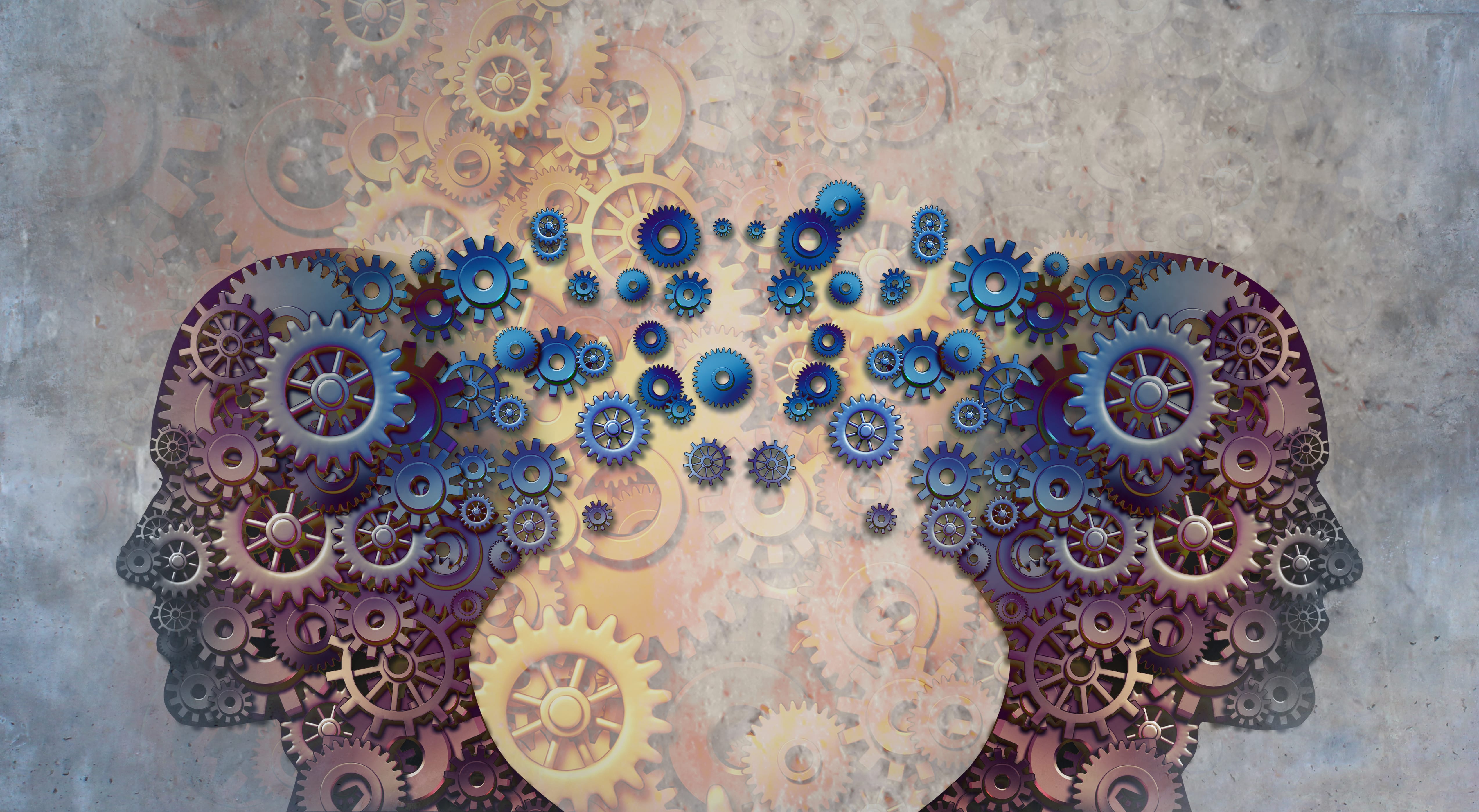
The human brain uses two markedly different systems for processing information and making decisions. The first is an automatic, fast and often subconscious way of thinking, which requires little attention or effort but is prone to biases and errors. This is called System 1.
The second is a much slower and more controlled process, which requires energy and attention but, once engaged, it has the ability to filter those instinctive biases and errors. This is known as System 2.
Of these, visual stimuli are by far the most dominant, with around 90% of our System 1 being concerned with making sense of what we see. As such, it can be argued that many of our conventional approaches to persuasion through communication—headlines, copy and voiceover—appeal to our rational decision-making and, therefore, may be far less influential than the visual cues people decode subconsciously.
This effect enables marketers to code design with visual cues that connect a brand intuitively with a concept borrowed from culture or other categories to evoke a similar concept. For example, the Adidas flagship store in New York borrows heavily from the world of stadiums, featuring concrete entrance tunnels, locker-room-style changing rooms and ticket-booth cash desks, all of which cement the brand’s link to sport.
And while we are all aware of the power of humanity in connecting audiences to brands—like a cute baby to engage us or a directional gaze to shift our attention—we can go beyond many of the more obvious uses towards subtler but nonetheless powerful ways to infer human characteristics and connections, through the use of personality, individuality, human touches, imperfections and names.
Such ideas are not new, of course. Back in 1944, a psychological experiment found that subjects who had watched a short, animated film showing the basic movement of simple shapes were quick to make sense of what they had seen, creating characters and storylines by association with these seemingly ambiguous visuals. Today, many brands are finding success from building visual cues and strong associations into their design: like Bonne Maman, whose jars, lids and labels epitomize the feeling of “homemade” (which they most certainly are not); and bad-ass coffee brand Bandido, whose ‘B’ has been cleverly rotated to form a Zorro-style mask.
The overall look is important, too. System 1 interprets beauty as something which has been invested in, cared about and has self-belief. This means we will instantly decide that we would be prepared to pay more for an aesthetically pleasing brand because we believe it is worth it. The same process also skews our judgment on things like web content. People decide whether they like a web page within 0.05 seconds of seeing it by reacting to the overall aesthetic, rather than to the content itself. So, while sweating the content is important, even the most substantive message will be poorly received and interpreted if we don’t pay attention to the overall design.
By understanding some of these principles, we can use neuroscience not only to measure more precisely but to create more effectively in the first place.
John Clark is planning director at WPPs Coley Porter Bell. This article is published in collaboration with Adage.com

