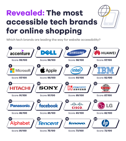
For those wanting to browse the internet and shop at their favorite brands, the new Online Shopping Accessibility Index from the experts at Affise has determined which of the world’s most valuable online brands and retailers are the most accessible to a wide range of web users.
Web users that are visually impaired, suffer from hearing loss, or have neurological or cognitive limitations can struggle to navigate through websites which can make online shopping an extremely difficult task.
Using Google’s Chrome DevTools and Lighthouse, the Online Shopping Accessibility Index determines the user experiences of some of the world’s top online conglomerates, to discover whether the best interests of all customers are really at the heart of operations.
Top 10 most accessible online brands in the world:
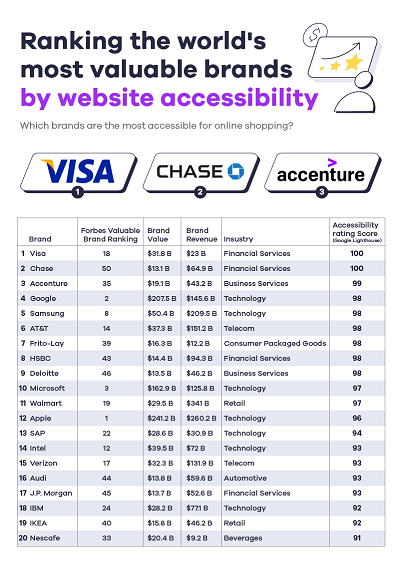
Utilizing ‘Google Lighthouse’, a tool that takes into account factors that compromise a site's accessibility such as unhelpful alt text, irrelevant page titles, and brands using color to convey their messages, the report determines which brands came out on top regarding their appeal to as wide a range of web users as possible.
Taking the top spot is financial service provider Visa, scoring an admirable 100 in the convenience rankings. This includes only one web accessibility error and 13 web alerts, highlighting that a great deal of time would have been spent on making things suitable for customers with disabilities.
Second on the list is Chase Bank, also scoring 100, with one accessibility error and two contrast errors.
Ranking different industry sectors by their online accessibility credentials
Are some industries simply more accessible when it comes to their online offering than others? The report suggests that different industries have taken more online shopping accessibility measures than others when it comes to online shopping.
Most accessible automotive brands in the world
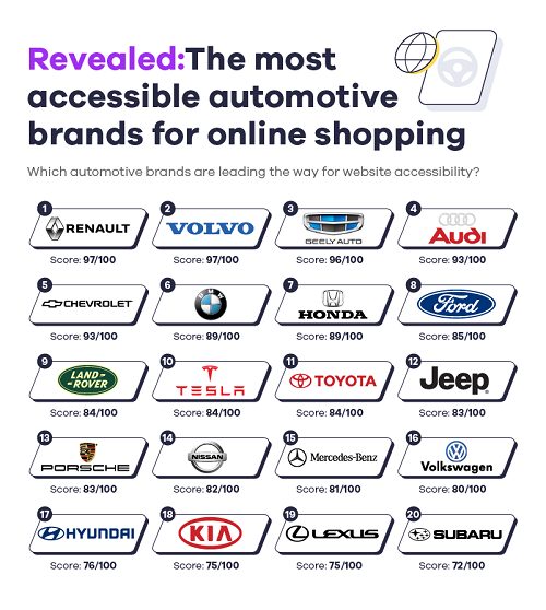
At the top of the automotive industry were Renault and Volvo, both scoring 97. However, Renault was seen to have 120 accessibility alerts, while Volvo only had 34. Despite scoring the same score, the Renault website features more alerts than Volvo overall, perhaps due to the website's small text which makes the site difficult to read, particularly for those with low vision.
A redeeming feature for Renault is the website's black and white color scheme making it ideal for colorblind individuals.
Most accessible hair & beauty brands for online shopping
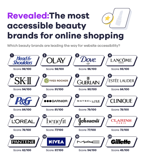
Anti-dandruff hair brand Head & Shoulders emerged as the most accessible hair and beauty brand on the list, with a score of 98. With zero accessibility errors on the entire site, and just 15 other problems flagged, the haircare powerhouse is a force to be reckoned with when it comes to user-friendliness.
Second on the list was Olay, also scoring 98. Impressively, the beauty brand also had zero accessibility errors on-site, alongside 33 detected issues, highlighting the time and effort taken to make its online presence as convenient as possible for disabled people.
Skincare giants Dove scored a respectable 96, placing them third on the list of the most accessible beauty brands.
At the bottom of the list was Gillette, with a score of just 45, suggesting that there are definitely changes to be made to the website.
Most accessible online fashion websites
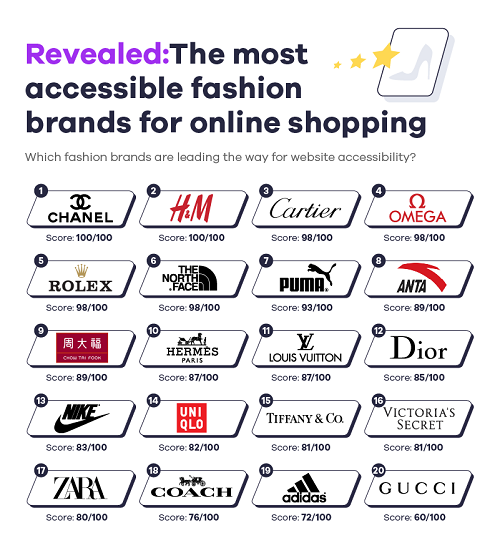
Luxury brand, Chanel took the top spot, with an awe-inspiring score of 100. This also takes into account six accessibility errors and 15 alerts, placing the luxury brand firmly in the lead.
Next up was H&M, also with top marks of 100. 43 overall errors showcased the company’s attention to detail when it came to online accessibility, which is instantly obvious thanks to its clean, minimalistic color scheme.
Trailing behind was luxury brand Gucci, with a less than desirable score of 60. What is immediately recognizable is the brand’s reliance on color to convey their message, as the busy, garish site would no doubt make things incredibly difficult for colorblind people to read.
Most accessible restaurant websites
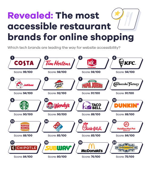
For anybody with access needs looking to research the menu of a restaurant or food service establishment prior to a visit, a clear and easy-to-follow website is a must-have. Taking the top spot for the restaurant industry with an accessibility score of 99 and just 18 errors flagged, is beloved coffee shop chain Costa.
Next on the list is Canadian multinational fast food restaurant chain Tim Hortons, scoring a very respectable 98. Despite some messages being conveyed through color, such as vegan options in green, the website is very simplistic and easy to navigate.
In last place is restaurant chain Wetherspoons, with a score of 75. 64 highlighted errors were found in the report's research.
Elements of the Wetherspoons website that could be considered for improvement involve enhancing the alt text on included images, simplifying the color scheme, and improving the contrast of the site, for people with color-contrast sensitivity.
Most accessible tech websites
