“Design is more than a logo. Design is a strategy made visible.”
These are the words of Moira Cullen, vice-president of global beverage design at PepsiCo. And they couldn’t hold truer for Arab News.
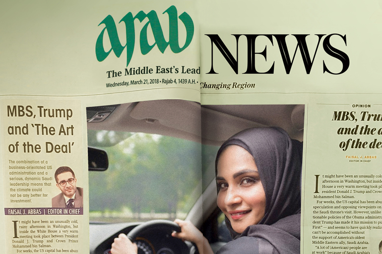
Arab News, and its home country Saudi, both have ambitious plans. Plans that have an air of openness, while paying homage to their roots. “Our whole design philosophy mirrors a changing region with strong values and convictions, and captures that energy and movement,” says Simon Khalil, global creative director, Arab News. In order to achieve this, Arab News worked with design consultancy Innovation Media Consulting Group. “The new design tries to reflect its [Arab News’] print legacy, while projecting modernity and change,” adds Vasco Ferreira, senior consultant at Innovation Media Consulting Group.
The process started with scouring through some of the world’s biggest and best newspaper brands to observe how they display news and digital content, which helped develop a modern design and unique experience, explains Khalil.
Although the design is modern, there is a clear connect to the brand’s Arab roots, which is represented through the flow of the Arabic script in its subdeck styles (basically, the line below the headline) and kickers (the short text line, sort of like a section header, above the headline) in the new layout. Moreover, Arab News’ new design is also a platform for regional and local creative talent. For instance, Saudi artists will provide the illustration for the opinion section. “The whole region is rich with great creative talent whether it is photographers, artists or designers, and we want Arab News to reflect this and be a platform to showcase this talent,” adds Khalil.
A key part of this – or any – redesign is the typography. It is essentially a brand’s masthead. And so, the main font chosen was, Austin, “a modern, didone [genre of serif typefaces] typeface, which immediately gave elegance and a sense of ‘old school’ journalism and credibility to the design,” explains Ferreira. Austin was complemented with Isento, a new sans serif in the grotesque tradition, created by acclaimed type designer Dino dos Santos, “who gave it an unmistakable contemporaneity and accessibility,” adds Ferreira. At the core of all of these design elements is ‘centrality’ – one of the pillars of the redesign. This centrality is reflected in every page where all content and imagery revolves around the center axis. Explaining the rationale behind this centrality, Khalil says, “As the voice of a changing region, Arab News is not only at the center of this change, but must also exude that change.”


